Sunday, February 27, 2011

Our daily commute

People in cities such as Boston, New York or Chicago take mass transportation for granted.  These cities have incorporated transportation systems into the city inrastructure for decades and thus, their use has become second nature to residents and commuters.  Their daily expereince is relative based on living in New York, Boston, etc. when compared with say Cincinnati or Nashville, Tn.  What I mean by this is that our current perception of transportation (and life in general) is molded by the geographic region we reside in.  A person in Cincinnati might say, "I can't take the bus because the stop isn't by my house and I would have to drive 10 minutes to get there."  Meanwhile, a person in New York may walk 10 minutes to get to a subway station or bus stop.  It's all relative.  Sure, New York residents might have to walk 5 blocks to get to a subway stop.  Many also do not have car insurance costs, gas costs, maintenance costs, etc.  But then the midewesterner will gladly drive 60 miles round trip every day at $3.40 a gallon because the nearest bus stop is "not convenient."  Is spending $100 dollars a week on gas convenient?  Does the American economy appear prepared to support millions of middle class workers at this rate?  I doubt it.

Public transportation in Cincinnati and Ohio is a joke.  It is not embraced nor endorsed except by those living within the urban city core.  In 2009, Ohio rejected its share of President Obama's $8 billion American Recovery and Reinvestment Act fund, intended for high-speed rail development.  So here we sit, the typical midwestern city, dependant upon the automobile for survival.  To get suburbanites out of their cars and onto buses (and hopefully someday light rail) we need to promote a cultural change.  We need to provide an experience that not only offers cost savings, but also adds value to the life of the commuter.

In looking at the sequence of approaching, entering and moving through the proposed site, I am looking at what spatial tools can be used to accent the journey.  As stated, the site is wide open and can easily fall into a "big box" mentality.  The site must be broken down into individuals pieces that are expereinces in an ordered path.  When these pieces are linked together, they create an experience for the commuter.  This is important and necessary because to change the culture and mideset of people, we must appeal beyond the cost or time savings aspect.  The aesthetic must be present to create a space orseries of spaces that give the user a feeling of control, togetherness and ultimately community with their fellow commuters.

This series of vignettes looks at the spatial sequence of approaching, entering and moving through the site.  PLEASE NOTE:  These are preliminary forms, suggesting possibilities.  I am more focused on the ideas of space and a connected experience.  The final building forms, trees, benches, etc. will follow once the spatial ideas have been defined and understood.

Aerial of site looking West - Vignette markers listed in red
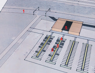

1.  Approaching from the South
The immediate difficulty of the drosscape site is realzed when viewing the approach.  The danger is creating an object that sinply exists in space as their is little surrounding context to relate to.  However, there are several strategies to be used that can combat this.  First, the bus access and pick-up is on the main road side, open to view to passing traffic.  By making the primary building function visible, we provide the building context within the site.  Likewise, as people drive by, they can see the buses and people waiting, boarding or departing.  This creates a psychological clue that can be understood - similar to the idea of having the streetcar tracks as a permanent fixture within the community.  A sign and a plastic shelter do not inspire faith in a transportation system.  A structure with varied spaces does this.

2. Exiting the car
As mentioned in yesterday's post about site analysis, a key component to creating an experience for the traveler is to define paths of travel.  Drive aisles and parking are for cars and cars alone.  Pedestrian paths are provided on islands between the rows of parking.  There are many possibilities to the aesthetic nature of this path.  However, a key component is the addition of a vertical element to define the space in the "z" direction.  This does not have to be completely covered and it would actually function best if natural light filtered through.  The idea is not to provide actual protection, but the feeling of protection.  Also, the exterior pedestrian corridor is a unique and memorable experience for the user simialr to walking down the steps of a subway.  Lighting, materials, function - all have changed when compared with the asphalt lot.

3. Moving down the pedestrian path
The forms here are simply a suggestion as to the aesthetic possibilties.  The structure could be round, square, more linear, etc.  The key is that a defined path and space have been created.  A space that provides safety and function for the user.  This path should relate to the building as well however.  The difficulty will be in connecting this path with the building form so that they are seen as two interlocking pieces as opposed to seperate experiences.  Another thing I wnt to point out is the view to the bus in the distance.  Within the site, I feel this is a key component to a successful design.  The building beyond has been separated into two interior forms with a central exterior connector between.  The parking path leads to this exterior space and directly to the open air boarding area.  The ability to visualize one's destination is a comfort to commuters.  They may be rushing, late or walking in the rain.  To be able to see the clearly see the destination is a comfort for the commuter.

4. Approaching the terminal
During the past feel weeks I have been looking at how space can dictate flow and use but also provide the user with a choice.  As the commuter exits the pedestrian path and approaches the building, the path and destination is clearly defined, yet there there is a choice.  The building to the left and right will house services for the commuters.  A coffee shop/cafe, newspaper stand, ticket booth, lounge, business area...there are numerous programmatic possibilities.  The commuter has the choice to head directly to he platform or stop and enter the building.  Once inside, there is another sequence of space that occurs (yet to de defined)

5. Moving through the open air space
Similar to the pedestrian path in the parking lot, the open air intermediate space provide the feeling of shelter and allows natural light to filter down.  This space would contain benches, landscape, etc. and also functions as the primary access to the boarding zone.  Functions are mixed and commuters mingle together.  This is the terminal or waiting area - a space where people can see and be seen, grab a coffee, read a book, etc.  There is a community feel in our daily commute and this space is the gathering space for that community.  Remember, the people who currently use this bus stop wait in their cars until the bus enters the lot and then exit their cars to get on.  Here, there is a space which provides a service and brings people with a common goal and interest together.  I truly believe that much of this is related to the psychology of how we treat commuting - just as much as it is important to create function space to serve our clients, we should understand the emotions that are evoked by the space we create.  This terminal is a bookend to the "daily grind".  A space where commuters will arrive early to grab coffee and catch up with a friend.  A place where they may stay and talk in the plaza or perhaps grab a drink in the cafe.  A space that we transition from home life to work life in the morning and back again in the evening.

I'll close this post with a quote from James Howard Kunstler's "The Geography of Nowhere", where the author discusses the dangers of automobile transportation.

"The costs of all this driving in terms of pollution, which includes everything from increased lung disease all the way up to global warming, are beyond calculation.  The cost to society in terms of money spent building and maintaining roads and paying for traffic police, courts, accidents, insurance, is also titanic.  The least understood cost-although probably the most keenly felt-has been the sacrifice of a sense of place: the idea that people and things exist in some sort of continuity, that we belong to the world physically and chronologically, and that we know where we are."

Saturday, February 26, 2011

Creating the experience...exterior

I recall a conversation with Herb from first semester about the "romantic" nature of streetcars verses buses.  One of the reason that streetcars are successful and view as more desirable than buses is the tangible system they provide.  For example, if someone living in an urban environment along a bus route looks out the window of their apartment, they may or may not see the bus.  If the bus is not there, there is no indication that the bus system exists.  However, if a streetcar system is in place, and one were to look out the window, the tracks and wires would be visible.  This tangible infrastructure is a grounded and recognizable system.  it creates a psychological reaction in knowing that whie the streetcar itself is not outside the building, the systems are in place to keep that person connected.

Creating a suburban transportation hub requires the same thinking.  Without a station or a visible, permanent precense, the bus will never be a desired mode of transportation.  There must be a tangible and understandable place when commuters know they can go to access transportation.

These forms are preliminary and general, but the sequence of space is outlined.  When we encounter space that is broken into various sections, movement is created.  Paths, threshold and destinations become design elements.  Likewise, functions are clearly identified.  Cars function in car areas, people in people areas, and buses in bus areas.


The pedestrian path from the lot to the building entrance is the commuter's first experience within the site.  Typical parking lots are single aprons where cars and people share the same paths.  This leads to cars becoming congested as they must loiter behind people who are walking.  Obviously, there is a safety issue as well.  A seperate path for pedestrians begins the spatial expereince.  Perhaps there is some type of covering, not completely sheltered, but semi pervious to light, rain, etc.  This path leads the commuter to the entry plaza and eventually the building interior.

Site Options...

There are several possibilities for site selection at the Kings Mills site.  While the existing landscape is free of any structures, there is an existing parking lot that dominates the site.  It would make the most sense to re-use this parking lot and re-develop it as an integral part of a new drosscape intervention.  However, it is worth looking at the other options to see how their benefits might aid in the development of Option 1.

Site Option 1 (most desired)

This option orients a new transportation terminal along Kings Island Drive, the main access road to the site.  his road also has direct access to I-71, the main highway to Cincinnati, to the West.  This solution takes advantage of the existing parking lot and allows for the partially developed site to be reused.  By orienting the building to both the parking lot, road and highway, there is a visible link to the forms.

Option 2 (least desirable)

Option 2 would use the open green space to the South of the existing parking lot.  There are little to no benefits to using this space.  Additional parking would need to be created and the existing parking lot would be even more wasteful than it currently is.  This site could be marked for future development to augment the station once it is established on the Option 1 site.  Perhaps and exterior park or space for business people of even a facility for the buses/trains?

Option 3 (the rest stop)

Option 3 proposed some unique circumstances that are desirable in site selection.  First, the site is heavily wooded, meaning a new building could be interwoven within the landscape, rather than existing on it's own.  Simple luxuries like shade and landscaping can make the commuter expereince more relaxing.  Also, the building is oriented directly to I-71; the identifiable transportation link is made.  However, again, the drawback is that the existing parking lot remains unused and an area with trees would be altered.  Some of the pros of this site can be applied to the option 1 site.  Shelter for the commuter (not just man-made) / orientation to the existing transportation

Connections...

Society as a whole is becoming more and more connected as technology advances.  We constantly see ads for "global networks," facebook and cell phone allow us to monitor the exact location of individuals.  For better or for worse, the American people have become a voyeuristic society, obssessed with celebrities, reality tv personalities and tabloid gossip. We like to be connected; in-the-know.  We discuss Brad and Angelina or Bieber's haircut over dinner or drinks as if they are our friends.  We love to people watch or in some cases, like to be watched, or at least noticed.  This is why so many people like airports - there is something unique and fun about seeing a rush of people mingled about; wondering where they are going or what there story is. 

In a sense, our morning and evening commute can replicate the same expereince.  For a given amount of time every day we share a bus or train with a number of other people.  There is a common bond or togetherness to this process and expereince, even if it can be unpleasant at times.  Ina  place such as Cincinnati. this bond is absent as most commuters ride alone in their cars.  A commuter hub within the suburbs provides not just a practical and economical solution to the issue of commuting, but it also fosters community and togetherness between the users.

The goal is to connect downtown with Kings Mills, a suburb 25 miles North of the city.  The graphic below shows the socio-economic distribution in Cincinanti along with the major highway routes.  As one moves further from the city core, the number of wealthy and upper clas households rises.  These are the individuals who are solely commuting every day.  The lower class residents closer t othe city do use the bus system.  The goal is to get the individuals in the blue and green zones on the bus, or hopefully light rail someday.

The connection to be made is highlighted along I-71, the bold red line.  This links the proposed site to the downtown transportation hub.

Friday, February 25, 2011

Open space design

As mentioned in an earlier post, the site that I have chosen is approximately 25 miles from downtown Cincinnati and the surrounding area is home to a large middle to middle-upper class community.  The commuter parking lot is currently at the southwest corner of a large parking lot that King's Island Amusement Park uses.  I laid the site out in sketchup and there is NOTHING there.  No shelter, no trees..there is only a single light pole in the area and a set of traffic lights on the adjacent main throughfare.  Otherwise the site is a completely blank slate of asphalt and a little grass.


You can tell where the bus pickup is because of the location of the handicap parking spaces.  Have you ever seen handicap spaces without a building?  Those spaces are the only indicator that this area has a function beyond a parking lot...why are these handicap spaces here?  What is access needed for?

In approaching the site, I first am considering design within the drosscape and how buildings exist within open or empty landscapes.  Likewise, how can a building or space effectively create a meaning space on a site that has no true contextual surroundings.  As you will see in later posts detailing the intervention, the connections must be far reaching and the building in a sense must be able to individually define the site.


A single building within an endless or vast landscape can enhance the feeling of isolation.  Without other buildings to relate to or even landscape forms, buildings feel lonely and inaccessible.  The barn in a field has a majestic, historical quality to it as we hold a certain sentimentality for a landscape such as this.  But replace the barn with a Home Depot or Kmart and what do you have?  What is that relationship?  How can architecture make the isolated building experience better?  More accessible?


Monumental buildings often stand alone and act as a destination.  Is it the function, the history, the cultural meaning that makes these buildings desirable?  Unlike the barn in the field, the monumental typically is surrounded by a procession of space and form.  Here, large processional paths lead to an elevated platform, supporting the building.  A grand identifiable entrance is provided, centered on the building and landscape plaza.  This approach solves the issue of isolation by dominating the site, and creating a grand and overly garish presentation.  It imposes it's precense on you and commands your attention.


The urban drosscape as created by American big box retail and commercial buildings.  This scene is repeated thousands of times in thousands of towns.  Why does this arrangement fail to address isolated buildings successfully?  Each front building facade is oriented to the street with expansive areas between each building.  Just as if you sat next to a person and looked straight ahead, and not at them, this is a closed off and cold relationship.  The car and parking space also drives this method of design.  there is no pedestrian access.  The sequence and procession of the user expereinced is reduced to the climate controlled car ride, followed by a brief dash across asphalt to a rectilinear conditioned space.

In looking for ways to make isolated buildings more approachable, accessable and integral to our community, it helps to look at some ways that "empty" space is addressed.  "The Gates" installment in Central park by Christo and Jeanne-Claude embody the marking of space along a path.  The running/walking path alone is a two dimnsional form that follows the landscape.  By adding the sails, the path becomes three dimensional.  It is as if a corridor or space which we can be contained within has been created.  this is successful because the expanse of park around the path provides enough space so that the path does not feel constrained.  How can the marking of path and access be used to better approach and enter isolated buildings?


Monday, February 21, 2011

Identifying the area of need

I was watching a special this evening on CNBC about the big business of supermarkets and it went into detail about how we shop and why we buy the things we buy.  One of the main points of emphasis was both the experience of the “market” store and the “journey” we take through the store.  It is not simply the products contained within the store that draw us in, but rather the presentation, lighting, and color that engage our senses.  Customers are not simply coming once a week; they now visit 3, 4 or 5 times a week.  They eat lunch at the store, taste wine, socialize – it has become a destination rather than a weekly chore.  The layout of the store has been updated to meet our modern needs and tastes as well.  Gone are the long parallel aisles.  Instead, a perpendicular aisle now intersects the rows.  This offers the consumer an “escape” route should they enter the aisle and realize they need to get somewhere else.  Likewise, the layouts feature curves and clustered intersections.  The goal is not to confuse, but rather to offer more possibilities to explore and move about (and store more product). 

Watching the show I realized how important the space became in creating the experience.  It wasn’t simply what was in the store – it was the atmosphere and experience that people sought.  In a sense, this is the same feeling I am seeking to emulate in the design of a new bus station within existing suburban sprawl.  It is not simply about providing a waiting area that is warm or cool or dry.  It is about creating a space or a sequence of spaces that enhance the user experience.  Yes, a bench and an enclosed plastic cube can keep you dry or out of the wind possibly.  But if you miss your bus or train, do you want to stay there?  Just like the new grocery store, the bus stop or train stop should be a place of comfort – a place that generates positive thoughts and is even sought after by commuters – a place of refuge before or after a long day.

This is a map of the site I have chosen for the competition.  The bus stop is located in the southwestern corner of a vast parking lot that serves King’s Island, a local amusement park.


As I mentioned yesterday, I spoke with a friend, Jessie, yesterday about the commuting experience from this site.  Jessie lives about 5 minutes from the bus stop and while she no longer takes the bus, she did ride for about 8 months.  We spoke for about an hour and she described the daily experience; likes and dislikes, etc.  This is an account of her experience.
Jessie would drive to the parking lot and arrive about ten minutes before the bus was scheduled to arrive.  If the weather was fair, Jessie would exit her car and stand outside to wait for the bus.  There was no shelter provided at the lot nor was there a designated waiting area.  Commuters would typically form a random line based on who was waiting outside first.  On days when the weather was poor, Jessie would remain in her car until the bus entered the lot.  She would then exit her car and board the bus – the other commuters would do the same.  Jessie’s stop was the start of an express route directly downtown, so typically around 40+ commuters would get on at her stop.  Once on the bus, people generally kept to themselves, however, the commuters typically remained the same so bonds formed over time.  People would converse about what they were reading or discuss common interests.  The trip downtown would generally take about 30 minutes in the bus (buses are permitted to ride the shoulder when traffic is backed up).  By car, during rush hour, this trip may take 45 to an hour.  The bus route terminates at Government Center downtown and generally all passengers from King’s Island got off at this stop.
The return trip was similar in nature, although Government Center provided an open air waiting area that provided shelter in the form of glass panels and benches.

Jessie’s dislikes:  No sheltered area at home stop; no place to grab coffee, newspaper, food, etc.; no idea if bus is running late, delayed, etc.; absence of community (unable to joing co-workers for happy hour – has to catch bus); poor customer support from bus company – no presence at stop; frequent spills on bus – no place to put beverage

Jessie’s likes: no worries about driving in traffic; cost savings; safe; fast; ability to use commuting time reading, working, etc.

Identifying the area of need:  Quite frankly, when I picture 30-40 people exiting their cars in one choreographed motion as the bus enters the lot, I have to laugh.  This is very similar to the experience I described during the intensive of exiting my car and entering my office.  There is no sequence, there is no procession; it’s one and done.  I believe that an architectural intervention in the form of a bus station can not only improve the experience for the current commuters, but also attract more commuters in the future.  The potential exists to create a space which commuters will seek out as necessary component of their day.  It can add value and meaning and provide a defined and identifiable start and end point for the daily commuter journey.  Likewise, there is an added social/economic benefit.  As mom and dad begin to feel comfortable using the bus and bus stop, they will be more likely to use the station on weekend to take trips downtown for events, ballgames, etc.

This condition has been repeated about a dozen times within the outlying Cincinnati suburbs.  The King’s Island site offers an excellent site to test how a sense of place can be created for the traveler.  The next step will be exploring how sequence and layers are manifested within the drosscape to create personal connection and a desirable commuter experience.

Sunday, February 20, 2011

Testing ideas...

Over the past month I have been using sketch problems and precedent analysis to narrow some of the ideas that were first uncovered during the intensive.  These include:
layered space
personal connection
drosscape
a sense of place
sequence of space
adaptability
human spirit/emotion related to architecture

I have not been able to test these ideas fully or within a specific context up until this point.  I have decided to use a local design competition in Cincinnati to apply some of the design principles mentioned above.  The design challenge is to "covert drivers to riders," or to get people out of their cars and onto buses, bikes, streetcars, light rail, etc.  In approaching the competition, my goal will not simply be to "solve" the stated question.  It is not to provide an end-all solution to the question or even win the competition, but rather to test how some of the principles noted above can be applied to develop an intervention that addresses an area of need.  This is a change of approach when it comes to design, particularly a competition.

There are several scenarios that I am considering to test these ideas.  In no particular order:

1.  Re-imagining (or imagining) the urban bus stop in Cincinnati.
    Currently, most urban bus stops in Cincinnati are simply a sign on a post; no bench, no shelter, no schedule.  The metro system lacks a tangible, visible precence other than the buses themselves.  A physical shelter creates a defined and identifiable space for the passenger.  In designing a new bus stop, the idea would be for an adaptabale and interactive space that can be dis-assembled and relocated based on changing transportation needs.  It would also have a technological component allowing users to view schedules, routes, etc.
How this relates to thesis:  The definition of space is a key component I have been studying, especially with scale and layers.  It would be interesting to see how much of a sequence could be created within such a confined space as a bus stop.  How many people could us it? 1, 4, 10?  There is a layered component to the adaptability to this as well.  Perhaps it can expand over time if the need in that particular location is greater, or get smaller if the need is less.  The application or removal of new materials or spaces within the space is a unique analysis because it is not a building, but instead a 8x10 box.  I think this alone would be a fun and worth sketch problem even if it isn't the final solution.  What is the minimum space that we can occupy with another person before we feel uncomfortable and how can architecture increase comfort within a tight space.
 
2. The suburban bus stop
    The bus system curretly runs express and local routes from the suburbs to downtown.  The suburban pick up zones are typically located in existing parking lots of shopping malls or amuesement parks.  I spoke with a friend who used to take the bus along one of these routes.  She would drive a few minutes from her house to a sprawling parking lot and wait in her car, along with other commuters.  When everyone saw the bus enter the lot, they would all get out of their cars and form a random line to get on the bus.  There was no shelter what-so-ever.  My idea would be to provide a transportation hub for these outlying areas where suburban commuters could drive to and park, and then wait within a conditioned or semi-conditioned space.  It could have a number of support spaces such as coffee shops, a book store, small grocery; everything the urban traveler takes for granted.
How this relates to thesis:  This idea is similar to idea #1 in that it is the creation of a tangible form that people can associate with transportation.  One of the reasons that suburbanites don't ride the bus is that there is no visible infrastructure in the suburbs, other than the occasional bus.  The station creates a sense of community and offers a sequence of commuting together, beyond waiting in your car for the bus.  The friend I spoke with said people would talk and converse once on the bus, often about what they were reading.  What if there was a space for these commuters to interact before the bus came?  Likewise, she stated one of the drawback to riding the bus was that she had to leave downtown at a set time and could participate in co-worker dinners after work or happy hour.  Maybe the station fills that need.  This is about creating a better experience and a sense of place.  It is about the daily sequence of commuting and how we can make it more enjoyable, productive and economical for the user.  As I mentioned, the current stops are existing sprawl parking lots - drosscape.  These areas are very similar to space I studied during the intensive.  This is probably the most "solution" based idea I have, but there are a number of offshoots to it that interest and excite me.  Also, quite frankly, I think something like this truly would be a great way to get suburbanites on the bus, both during the weekdays and weekends.
 
3. The downtown transportation hub
There are several ideas and sub-deas here.  The current inspiration for me was Grand Central Station in New York as well as Union Terminal in Cincinnati (https://mail.mcgillsmithpunshon.com/owa/redir.aspx?C=d6ffd8a07122484c963485c5be62288b&URL=http%3a%2f%2fen.wikipedia.org%2fwiki%2fCincinnati_Museum_Center_at_Union_Terminal
The idea is to create a downtown transportation hub where buses and the new streetcar system converge.  Within this space, a number of functions are created; public gathering space, community, possibly a grocery or even retail.  Currently, the downtown "transportation hub" is government square, an open air space where buses enter and exit.  There is a series of glass and metal shelters here however it is open air.  Originally, my idea was to transform this space into an interior exterior space that offered a number of uses to the commuter.  However, I then realized that the current design was completed in 2007 by the firm who is sponsoring the competition.  Probably not a good idea to knock down their design (even though it would be a good idea).  That being said, I still think the idea of a transportation hub downtown is a worthy idea.  I am interested in reuse of existing structures, and since we are trying to eliminate cars, I thought that re-using and re-imagining an existing parking garage might be interesting.  Again, this could be a space that buses and the new streetcars could use.  It would be a space that commuters could use as a terminus for their commute.  It could also have shops, restaurants, etc. – everything a person might need or want while waiting for a bus.
How this relates to thesis:  The idea of re-using an existing building to make a transportation hub highlights my interest in adaptable design and the ability to “rewind” existing structures.  Again, the personal connection is created through a tangible space.  Most importantly, if I were to re-imagine a parking garage, the notion of layers and sequence could be greatly studied.  Moving from one level to the next; how each level functions independently from the other levels or works together.  How people move from level to level, etc.  The parking garage idea alone might be an interesting case study, however the overall idea is broad and needs narrowing.
 
The second idea interests me as there is a direct correlation to the "drosscape" i studied during the intensive.  Likewise, for the past month I have been looking at applying my design ideas within a vaccuum or a manufactured urban space.  This is a great opporunity to design a space within the suburban "drosscape" that applies these principles.

The first idea is also very appealing because the lack of a visible bus stop within the urban environment is not thought of, but shocking when realized.  I run, walk and drive through my neighborhood all the time and never really thought about this.  However there are 4 different routes that run directly through my neighborhood.  The "stops" are simply a single metal sign - no bench or enclosure.  The missing physical element of a bus stop shelter inhibits use as people do not think of a transportation element that is not readily visible.  This is similar to why streetcars are more desirable or "romantic" than buses.  When one looks out the window at an empty bus stop with no shelter, there is a negative association.  However, when one looks out and sees physical streetcar tracks, even in the absence of the streetcar itself, there is a tangible connection of knowing that the system is concrete and defined.  The tracks offer permanence and stability.  A bus stop shelter can achieve a simialr affect.

The competition is due March 10th.  i will be developing my idea up to that point and working towards a thesis proposal.

Sunday, February 13, 2011

Precedent Analysis - Olympic Park Seattle

I have chosen Olympic Sculpture Park and the Paccar Pavilion as a case study to analyze and apply some of my thesis ideas.  I chose this space because I feel there are many elements within the landscape, building and existing infrastructure that exemplify the idea of sequence and leyering.   These images are posted to VT, but I wanted to get a few of them on the blog for record.  Part one looked at documenting the space.  In response to Mike and Denise's comments on VT, I will be looking not only at the site, but also the connection to the city and buildings surrounding the site as well as the bay to the west.  I hope to analyze the site using sections and 3d compositions and vignettes to show how sequence and layering within the city context create a memorable space that people form a strong connection to.  More detailed sections through the pedestrian paths and buildings will illustrate some of the relationships, as will 3d vignettes to show how the viewer experiences each space.  If I have time, a study model would be very helpful in understanding the forms and relationships and how the unique sub-spaces are created within the overall site.

Part 2: Analysis will be posted to VT and I'll get some images up on the blog aswell.


Tuesday, February 8, 2011

Perception of layers

This is one representation of layering within an architectural sense.  Taking one simple form and transforming it one step at a time until the beginning form is almost unrecognizable.  This is not sequence in the manner in which we experience a building as we approach, enter, move through etc.  Building elevations are complete and fixed when we encounter them.  However, by studying how an elevation is created through layering, it helps to understand how place is encountered in plan or in vignette.  A space or building constructed through spatial principles should wash over the user in registered waves, rather than a single crash.  This allows us to ease into our own comfort level and make our own determinations and judgements in regards to the space.

These work much better when cycled through in windows viewer...


base form

                                                                adding the verticals

                                                                   adding the horizontals

                                                                          openings...
                                           
                                                                       ornamentation

                                                                         entourage

What is interesting in looking at this study is how the original box virtually disappears, but if we were to reverse this pages, we could go back to the box.  We always think in design terms of adding layers to create an end product.  Is it possible to take some layers away to return to a prior form or arrangement?

Week 6 Thesis Development

I wanted to give a little insight as to the direction my thesis proposal is currently headed.  I will be posting some sketches and images in the coming days to graphically represent the ideas discussed below.

The last two week’s sketch problems have been dealing with public vs. private space, transitions, sequence, layers, etc.  I realize some of my ideas and posts jump around a bit, but that’s mainly because I haven’t had time to delve into many of the readings I brought back and really analyze everything I’ve created up to this point.  I had a chance to do just that this past weekend and I feel I am headed towards a more defined thesis proposal at this time.

Layers.  Our lives are filled with layers.  When we think of something that has many layers, we typically have a positive yet inquisitive reaction.  A person who is said to have many layers is thought of as spiritually deep, skilled or diverse in their base of knowledge.  A problem with many layers, be it mathematical, economic, architectural, etc. requires inquisitive thought and is not easily solved with a singular answer.  Speaking in terms of architecture, layers create multi-dimensional space that provides the user with a sequenced experience rather than a singular event.  Stepping from my car in the parking lot at work and walking towards my office is a singular event.  The building exists solely as an object in space and provides no sense of procession or sequence.  A layered approach is absent.

The spatial condition created by layered architecture is sequence.  Walking through a museum is a sequence as is strolling down
Newbury Street
.  The sequence can be augmented, varied, interrupted or stopped.  This is done in a number of ways including change of scale, proximity, defined paths and edges to name a few.  I have been exploring these relationships and spatial ideas the past two weeks with my sketch problems.  So how do layers translate to a thesis proposal?

One of the ideas I have been interested in from the start of thesis is a “sense of place,” or spaces that are highly identifiable and hold special meaning for the individual as well as the community.  Spaces with many layers can provide this sense of place as they are multi-dimensional and speak to our explorative spirit as human beings.  But people change.  Opinions change.  Not all architecture is iconic and designed to withstand the test of time.

How can we use our knowledge of layers and sequence to create space that is adaptable and inter-changeable over time?  A space that remains inspiring and attractive even when the function changes.  To be blunt, like peeling back on onion to reveal more and more, or can we rewind and add more layers just as easily? 
Or, just as we are encouraged to use layer upon layer in our approach to “making something”, can this idea be manifested in built form?  I believe architecture can do this and that is what I will be specifically exploring this week.

This may still sound a little abstract, but I am working on some images and a thesis statement to better represent the possibilities here.

Sunday, February 6, 2011

A sense of place

Space can have a strong psychological affect and can create memories long after we leave.  Factors such as scale, geometry, sequence and lighting can create spaces that are desirable to visit and frequent.  Likewise, when we find space unremarkable or stagnant we form negative memories or opinions.  Buildings that do not inspire a sense of place within the individual are often isolated and disconnected from the surrounding landscape or infrastructure.  Meaningful public space speaks to our desire to become part of a greater community while remaining our individual selves.  The goal of this study is to begin to understand what makes space desirable for both the individual and the community.  Isolated buildings exist as objects in space and provide little to no connection to the surrounding environment.  We are presented with a facade or a view and process the entire experience at once.  There is no ceremony or procession in dealing with such space.  As a result, we do not identify with these objects, nor do we seek them out.


 A sense of place is created in a number of ways.  A functional hierarchy between small, medium, large, etc. provides variety and a unique landscape that is identifiable for the individual.  We expereince space as a series of steps rather than a single destination.  This sequence establishes a process in which we are able to move along a path which is defined yet varied.  Along this path we encounter areas to stop and interact with others.  Simply being within the precense of others can contribute to a sense of community.  Below, some techiniques for creating a sense of place for the user are shown.


Thursday, February 3, 2011

Pattern Language

I wanted to share a website and some information I came across during my thesis research and exploration.  I was reading Kuntler’s The Geography of Nowhere last night and came across the idea of “pattern language.”  Pattern language is the idea that everything within our man-made built environment should have a connecting relationship to the objects around it and should not exist simply as stand along objects in space.  This is an underlying theme that I feel I have been exploring from the start the intensive.  Linking space and providing connections between buildings in which there is no clear physical relationship is interesting to me.  Architecture and design are the tools with which to create these connections and I think pattern language is a good place to start exploring.

Anyway, I wanted to share this information with everyone.  Reading Nellie’s blog post about the Aalto’s hospital got me thinking about pattern language and the connections/transitions between space and objects.  Mary might find this useful too.